Wednesday
Oct282009
Vote for Your Favorite Logo!
 Wednesday, October 28, 2009 at 2:08PM
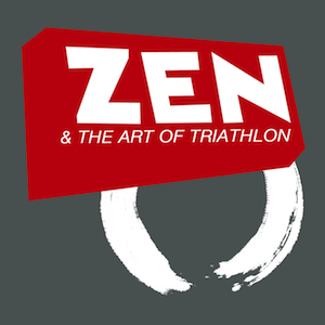
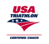
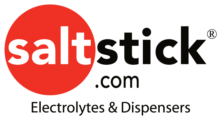
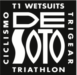
 @Mollybermea whipped up some logos for me to use for business cards. They rock! I definitely need help picking just one. Please vote for your favorite in the comments!











Reader Comments (34)
The black zen and the art one I think 2nd one down
The last one is my favorite. The first one is pretty cool also, but I really like the simplicity of the last one.
I like the first one the best.
I liked the second one best, but Emily said the first and last ones are the most simple and get the message across more easily.
I agree with you Tex. The 2nd one down is by far the best one, just not as a logo. As a sticker - yes / as a shirt - YES!!! "Zen and the Art of Triathlon" - with the vibrant red in the background. (If you made this one into a bumper sticker for the car/bike I would proudly pick a spot for it!)
However...the best one to use strictly as a logo would have to be the first one. As a logo for a website, it says everything that you want it to say...without overstating it...if that makes any sense?!?!?!
I like the first one.
I like the last one the best. Simple black on white.
I vote the first.
The 1st one--tops. 2nd place goes to #2.
Love the 1st Logo - looks like it is all happening on a massive wave!
The 1st one gets my vote. Very cool
First one - but it should just say "Zen and the Art of Triathlon"
I like the 3rd one, but wish it had as much contrast as the last one.
First one- but can I suggest that you just use ZenTri and take out "The Art of Triathlon". When it comes to logos, the simplest (but no simpler) is best. Plus, the text is so small I doubt it will reproduce well on a business card or other smaller printing.
Are these to be mainly for website/podcast promotion, or for coaching? If the latter, then the "and the art of" doesn't much matter, and I really like the first and third. Otherwise, I like the second better than the last, but I'd like it more if it had no more than two different fonts.
The first one rocks and the second one is pretty cool too!
All great logos!! Glad I'm not making this desicion!!! Why's it gotta be just one?
1ST ONE IS NICE BUT TOO BUSY, LAST ONE IS ZEN
Not much good in helping you make a decision, I like them all, sorry
As stated why dont you get them all printed, mix them up and use them all.
That way you'll keep things different.
Thanks everyone for the great comments. I didn't realize Brett would go all out and post these VERY rough ideas on his blog! haha.
I also love the idea of the first one, but maybe more for a t-shirt and yes, I realize the font off to the side would not replicate over to a business card. It was my "artsy" idea.
I have another idea.... I'll post to Texafornia ... appreciate everybody's input.
They are all great, but my favorite is the second one down from the top.
Thanks for producing one of my most favorite podcast shows!!!
Debby
FIrst one.
First one, with some modifications.. maybe to take "the art of triathlon" out of the middle loop and to maybe put that down below.
Second one I like, but there are just seems like there are too many fonts going on.
Also looking at the last three, "ZEN" is the major word sticks out. Where as in the first one there is a good balance between Zen and Tri. I think you need a balance, like in the show.
If this is a logo... then it really just needs to set up a symbol to remember it doesn't need to tell the whole story. For logo's I am all about K.I.S.S. method, i.e. - Ford, Dell, Chase, Coke, Pepsi
These are all great over all... much better than I could do.
I like them all, but the first one is my favorite.
Really liked number one.